Overview #
I have an O'reilly subscription and I like to read books either on my iPhone or iPad. I found the app UX - particularly the book reading screen - a bit frustrating so I tried to redesign it in a way that would work for me and potentially other readers.
As a disclaimer, I used my UX common sense here and didn't perform any user interviews as one would with a "real life" business problem.
The problem #
In this article, I'll concentrate on the iOS app as that's the one I use more frequently.
The app has the typical layout you would expect from a reading app. The main screen displays a list of books you've saved in your playlist, as well as books you might be interested in.
The bit I struggled with was the usability of the book reader itself. The frustration came mostly from icons that were not labelled and confused me time and time again.
Icons #
Labels #
An iOS app has a limited amount of space, which might make it tricky to provide labels for all options. However, providing labels for icons is considered good practice for usability.
The app is displaying too many un-labelled icons in a space that is not meant for them.
Consistency #
The icons don't have consistent line weights which results in them not looking cohesive. The colour of the top icons is also not consistent with the bottom. The red icons at the top stand out more and I am not sure that was the intention.
Actions #
Erik Kennedy talks about the laws of locality i.e. displaying a control next to the thing it affects. That makes sense. However, the O'reilly app is trying to show us all the actions you can take for a book.
I think that the less frequent actions don't need to be always visible when there is limited space.
Comparison #
I've compared this to 2 other apps I use regularly on my phone - the Kindle app & a free reader called PocketBook. I enjoy reading on these so I tried to understand what about their UX I find appealing.
Neither tries to display an overwhelming amount of actions in the bottom of the screen.
Redesign #
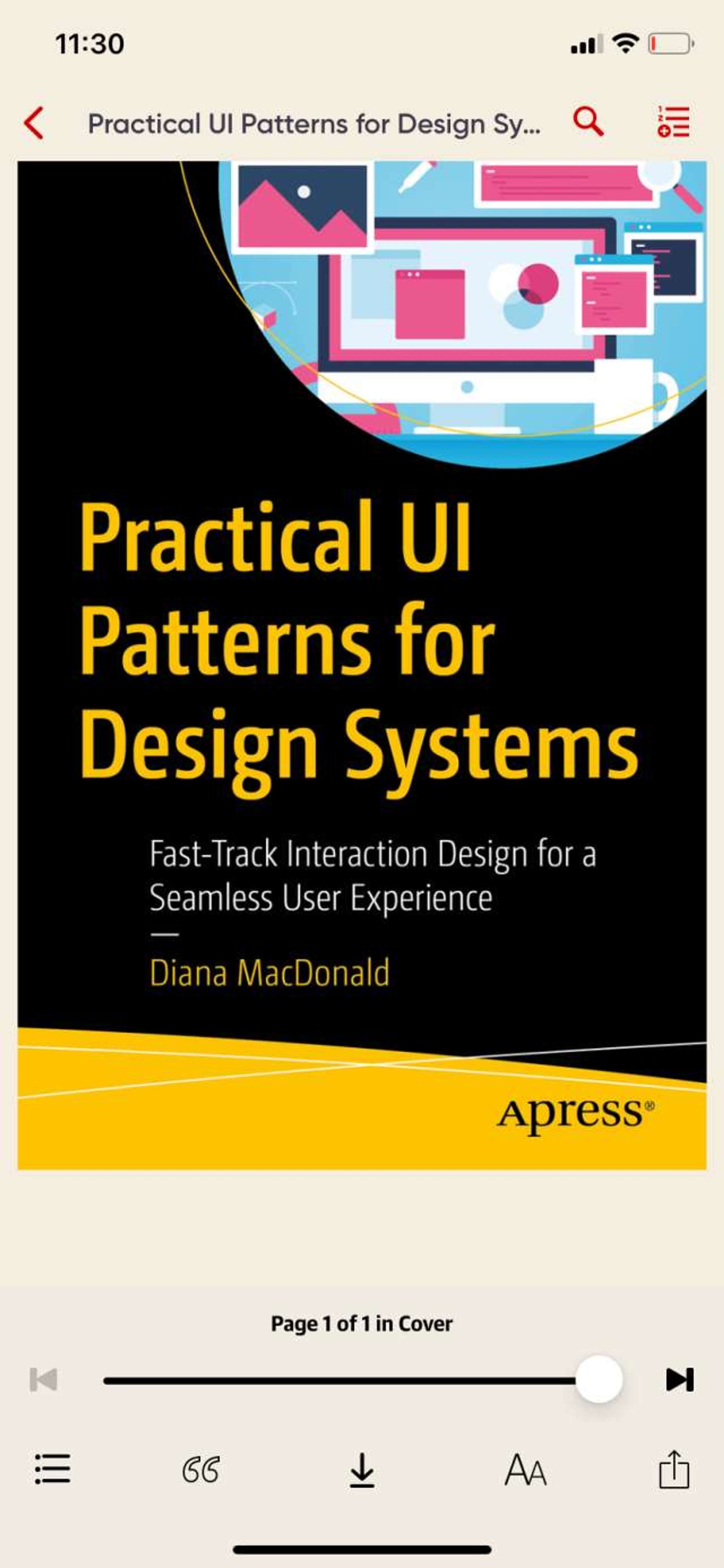
We start with the original O'reilly app design, pictured below:
Icon analysis #
I will go through all app icons, determine their purpose and identify whether they are frequent or one-time actions.
I started with the top menu bar:
- the magnifying glass is universally recognised as search. An action that can be used frequently
- the second icon gave me a lot of headaches, and it represents "add to playlist". This icon should be labelled appropriately as I don't think there is a universal "add to playlist" icon. A plus sign is the closest I could think of. Alternatively, this action could be left as just text and displayed in the context menu as it is not something users need to do frequently.
The bottom bar has the following icons:
- chapters icon, which should be labelled as it's not instantly recognisable. This is even more important as the design is so similar to the "add to playlist" icon. I confused these 2 icons many times and it frustrated me. Checking the chapters is something that can be repeated a few times, for example for going back to a certain chapter or skipping ahead.
- the quotes icon represents highlights. This is quite ambiguous again, and the frequency is debatable. It really depends whether the user saves highlights or not. Personally, I don't so I chose to omit it from the bottom bar in the redesign. However, in real life this should be tested with a cohort of users.
- the download icon is quite discernable, however downloading a book is a one-time action so I don't think it should take up valuable space on screen.
- the settings/preferences icon is in line with other reading apps and it's widely recognised as such. However, I still chose to label it in my design. This is an action that can be done frequently, for example at different times of day we might want to tweak the background colour.
My redesign #
This was made in Figma. For icon consistency, I grabbed an icon pack and used them throughout. I moved the infrequent actions to the context menu, as well as adding labels to the bottom bar icons. I also introduced a bookmark icon as that is something users do in the Kindle app for example.
The bottom bar has more room to breathe and could even take a third action if absolutely necessary.
Conclusion #
I hope you enjoyed going on this redesign journey with me! I particularly enjoyed improving the clarity of some of the actions by adding labels to icons. It shows that even the less ambiguous of icons should be properly labelled for added usability and accessibility.